- Public Website Redesign -
I met with the company's lead graphic designer to discuss the main requirements of the project and review existing storyboards in order to create personas for the website's core user groups. I also interviewed department leads to gather information on features they'd like to have on the public website.
TeamLiquid’s website is unique compared to traditional company websites as they cater to a wide user base with very different needs:
- Older fans who grew up in the 90’s and are avid readers of Esports news
- Business people looking to invest in Esports and want to research each top tier team to see who is worth their time and money
- The most important user base of all - children and teens who have been exposed to Esports through social media; who will eventually lead the future of Esports and where all future talent will come from
The following requirements were outlined as well:
- The public website will mainly be used to house information related to achievements, news, and results for all Team Liquid teams
- Allow fans to sign up for email & mobile notifications of upcoming events. Fans can also view a calendar of upcoming events on the website
- Create a visual repository of player information for each team that also showcases products from Team Liquid's partners that its players use
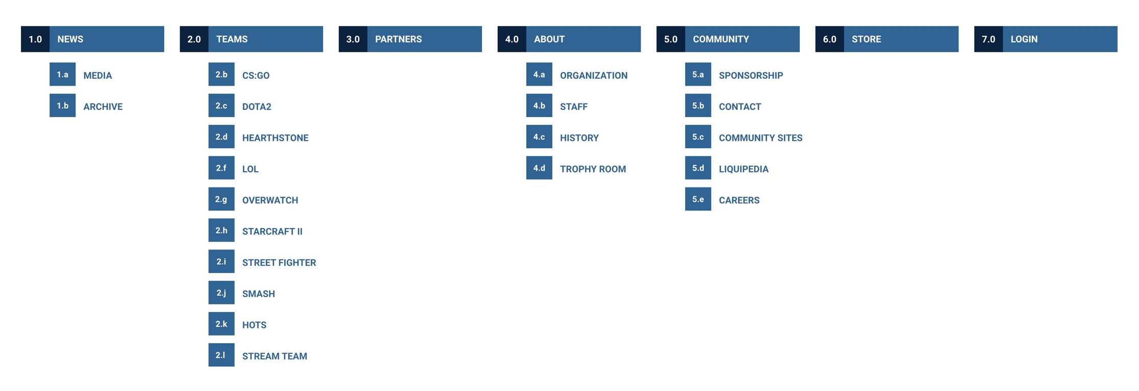
- Team Liquid public website sitemap -
As part of my preliminary research, I reviewed websites present on Awwwards, Webby Awards, Behance, etc. to see how certain functions and content are displayed to create a great user experience and how we can reference those aspects in the redesign. In order to gain a better understanding of the website's structure, I created a sitemap that captured the entire architecture of the website.
Wireframes
For my initial set of wireframes, I wanted to focus on high-traffic pages that covered the website's main functionalities. I also wanted to get a head start on defining interactions throughout the website. Instead of creating static wireframes, I decided to prototype in Axure because I could explore possible interactions for certain features while creating wireframes for the main pages of the website.
To view the wireframes, please click on one of the links below:
Overview of initial wireframe design decisions:
Desktop - navigation
- A side navigation was chosen instead of a top navigation bar since a lot of users will already be used to the side navigation of Twitch
- Side navigation can be expanded or minimized based on screen resolution and type of content displayed, allowing for more content space
- Sub navigation menu items show upon hover to reduce clicking
- Search bar is always present in side navigation for quick and easy searching
- Placing the website footer in the navigation allows easy access to social links
- Search bar is always present in side navigation for quick and easy searching
Mobile – Navigation
- Since users cannot hover over menu items, sub navigation menus can be opened by tapping on the "+" icon
- Search bar is initially minimized, but will expand across the entire header when search icon is tapped
Desktop - Home Page
- Home page will focus on featured news that are periodically updated by the content team
- Featured articles will auto scroll, however users can also click on the carousel to the right to scroll through articles
- Sub navigation menu items show upon hover to reduce clicking
- To give the home page more visual emphasis, only the featured article image will display when the page initially loads. The article content will display when a user hovers over the image
Mobile – Home Page
- Featured articles are not displayed in a carousel as it would be difficult for a user to scroll through
Desktop – News landing page
- This page will be the hub for all information related to Team Liquid teams
- The top section shows recent results, with arrows for users to scroll through
- Featured articles are displayed below, sorted by popularity or importance. This section will not be displayed as a carousel because users on this page will want to find the information most relevant to them as soon as possible
- Calendar – shows events happening in one-week periods, which can be changed in the header. Users can also filter which game events they want to see by using the top right filter. Events will include upcoming matches and community events. For dates without events, featured article(s) will be displayed that were posted on that date. SMS/email alerts were not added to the wireframe due to further discussions needed with the development team
- Latest News – displays small news articles sorted by most recently posted. Small news articles focus on quick announcements that do not require images or a lot of content
- Recent Videos – showcases what Team Liquid's content creators have been doing, can also display fan-made work
- Twitter Feed – displays tweets made by all Team Liquid players. Allows users to see what they're up to or if anyone is streaming. Also a source of real-time news
Mobile – News landing Page
- Amount of content displayed is reduced to avoid mass amounts of scrolling
- Calendar - users can tap on a date to enter in a custom date or use arrows to scroll through. Reduced the events schedule from weekly to daily. Events can still be filtered by video game using the dropdown in the top right
Desktop – News Archive
- Repository for all published featured articles that users can sort by Popular or Latest
- Users can filter articles by game using the dropdown in the top right. After selecting a game, a dropdown menu will appear with game-related tags that can be used to refine your search results. Tags are sorted by popularity or alphabetically
Mobile – News Archive
- Due to lack of horizontal space in mobile devices, the game filter is placed in an overlay that pinned to the bottom of the screen. Users can horizontally drag the game filter menu to see all filter selections. The game-related tags can still be accessed after a user selects a game
- Search bar sub header and tags will stay pinned so that users have easy access to them
Desktop – Search Page
- While visually similar to the News Archive, the Search page displays all published content and is tied to the search bar in the navigation menu
- In addition to a game filter, users can choose from the following media types to refine their results: featured articles, videos, small articles, and website pages
Mobile – Search Page
- Game filter overlay is used for this page as well. The media type filter can be accessed via the action menu next to tags. To view additional tags, users can drag to the left
Desktop – TEAMS Page
- Teams page contains a list of all players on Team Liquid's roster. Users can filter by video game or search for a specific player/team
- Game icon overlays show what game a player is associated with. Hovering over a player’s name will show an image of that player
Desktop – Player Profile
- Users can view player information, what peripherals they use, social links, and their achievements. Other relevant information is also displayed such as what role the player plays, what race they play, etc. depending on the video game
- Users can navigate to different players of the same team by using the left and right arrows below the player's profile image
After completing the prototypes, I met with Team Liquid's leadership team for the first time to review the wireframes. Leadership was not completely sold on the side navigation interaction because there was a high chance of users expanding a sub navigation menu when they did not intend to. They were also concerned with the incorrect profile picture being displayed when a user hovers over a player name, especially at smaller screen widths. The game-specific tags seemed too complicated. Users usually will know what they want to search for, so there doesn't seem to be a strong use case for the tags. On the home page, having an automatic carousel for the featured articles seemed cumbersome.
Taking the feedback I had received into consideration, I prototyped a second round of wireframes in Axure focusing on improving the side navigation interactions, ironing out features on certain pages, and creating wireframes for pages I did not get a chance to work on in my first set of wireframes.
Style Guide & Mockups
After a couple more design reviews, leadership and I agreed that the wireframes were in a good place and I could get started on creating the website's assets. Before delving into mockup creation, I consulted the company's logo style guide and used it as the foundation for the website's style guide.
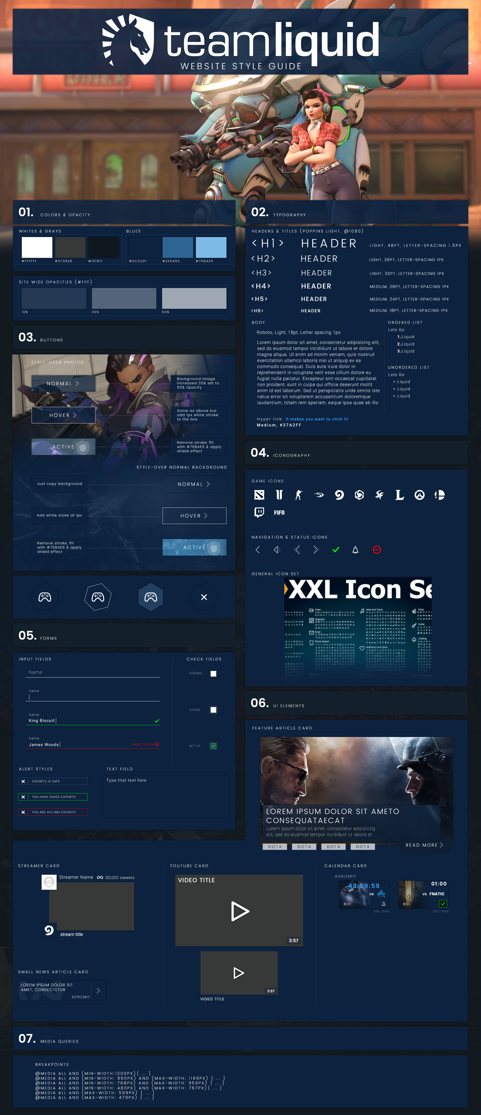
- Team Liquid Website Style Guide -
While creating the style guide, I already had a good idea of what reusable components needed to be outlined based on my wireframes. I also wanted to make sure each section of the style guide was specific enough to be used as a source of truth when future pages are created for the website.

- Team Liquid Website Desktop Mockups -
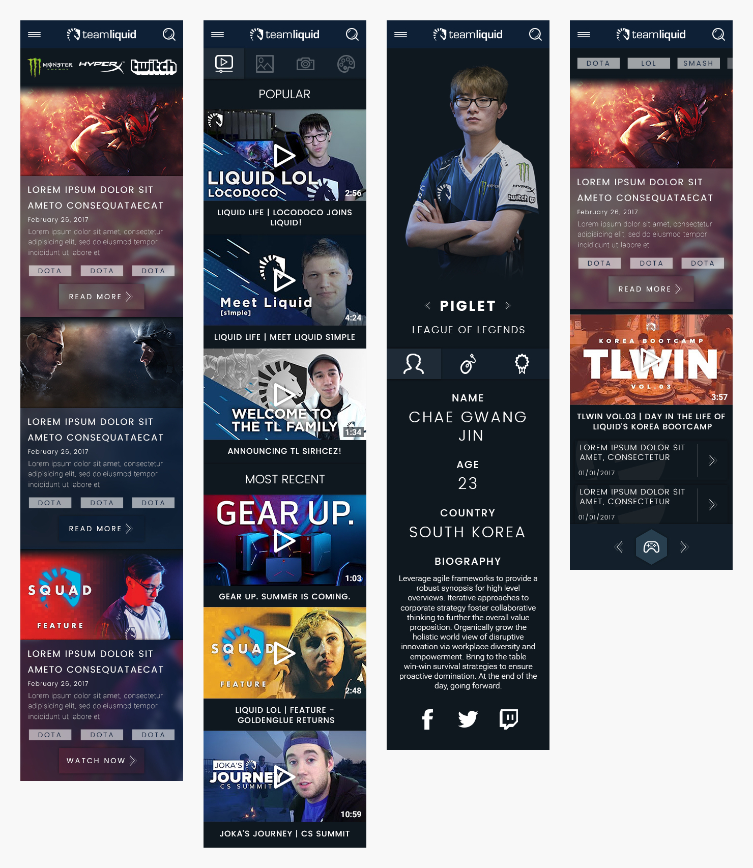
- Team Liquid Website Mobile Mockups -
After loops of feedback from leadership and weekly design reviews with the graphic design team, I finalized the mockups for desktop and mobile in May. Around this time, a front-end developer was brought onto the team that I would partner with to bring the website to life. I also began discussions with the back-end developer about implementing SMS & email notifications into the calendar to gain a better understanding of what constraints there could be.
Our front-end developer was an expert in website content accessibility and I learned a lot from him about the WCAG 2.0 guidelines and what criteria is used to judge a website's accessibility. I reviewed my mockups with him to identify any areas that did not comply with the guidelines and updated them in order to meet the WCAG 2.0 conformance level AA. During the development of the website, I provided copy to be used in alternate text for image assets and meta data descriptions in order to ensure the entire website could be read by a screen reader.
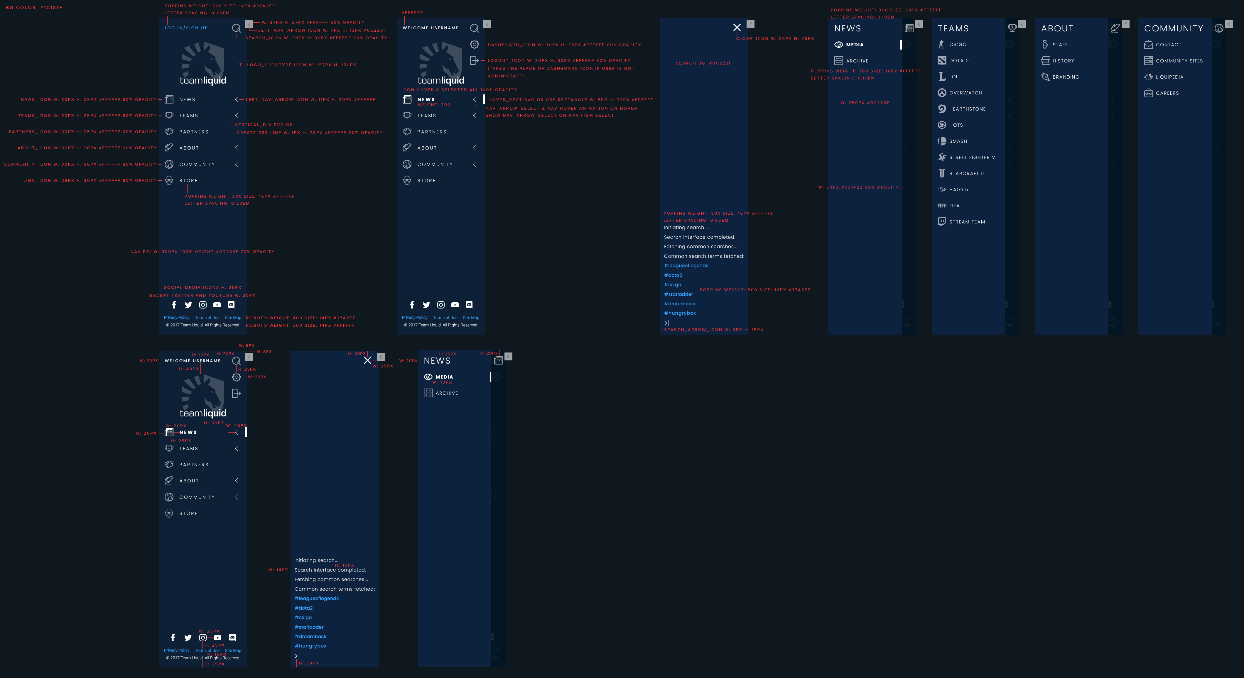
- Sample of Developer-Specific Assets -
On top of providing copy, I also created a set of developer-specific assets that focused on certain areas such as content spacing, different states of a component, and icon names. Front-end development for the website was completed in July 2017.
Due to the length of my contract, I was unable to run any usability tests while working on this project. I'd love to go back and get a chance to talk to visitors of the current website to gain insight on what content is the most important to them and gather feedback on the redesign. It would also be a really interesting exercise to see what responses we would get from Team Liquid fans and non-fans.