Incentives Manager

Company
ADP
Product
Tax Credits
Product Overview
Incentives Manager is a tax credits product within ADP’s SmartCompliance (SCP) platform that allows clients to get a visualized representation of their company's incentives and how each incentive is performing.
The problem we're solving is:
The current tax credits workspace within SCP does not provide a full picture of a client's incentives portfolio and only contains data for a specific type of tax credit called WOTC. Individual business incentives are currently prepared as ad hoc reports by an ADP associate; this process is entirely manual.
Product Goals
simplify
  • Improve ADP associate ability to service clients - with the new workspace removing the need for associates to create reports for clients, they can focus on fleshing out tax credit opportunities and training clients on how to use the workspace to fulfill their basic information needs
  • Take out the work - automatically provide status information on a client's incentives and actionable items to improve their incentives portfolio. Provide engaging, visualized data of how much has been monetized/realized and progress details for each incentive
innovate
  • Enhance client value through our next-generation solutions - clients will be able to identify tax credit opportunities that they have not yet taken advantage of and see which incentives are offering the most return. Clients will also be able to see which incentives are falling behind and what can be done to resolve those issues
grow
  • Dramatically improve the client experience - clients will get the maximum amount of tax credit realization with the smallest amount of effort
  • Retain clients - clients will be more inclined to stay with ADP if they feel that they are getting the most out of their incentives portfolio with the least amount of work on their end
  • Grow bottom-line financials - Increase tax credit realization for clients (thereby directly increasing ADP revenue)

- MVP -

User Flows

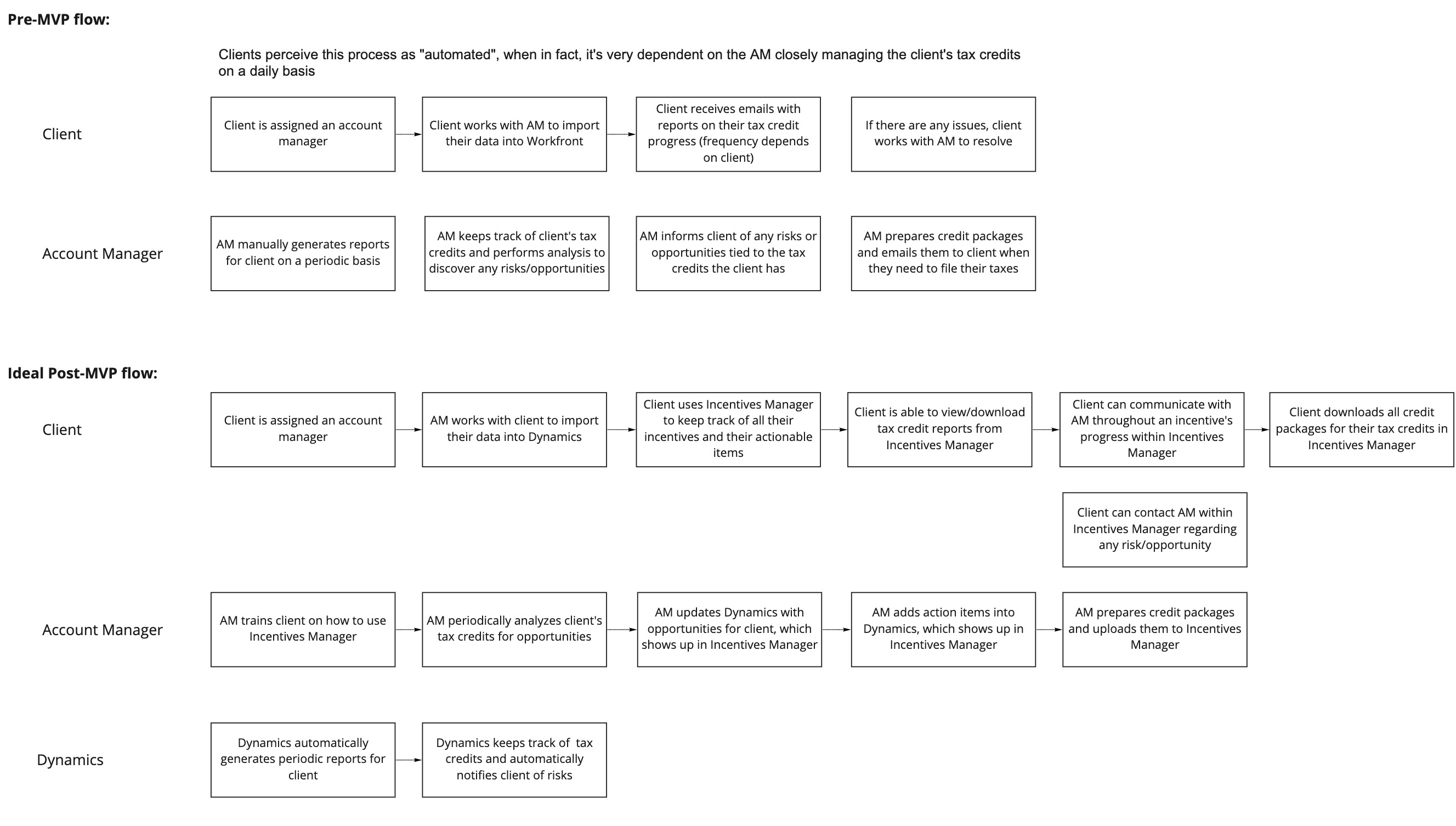
In order to gain a better understanding of tax credits, I met with the tax credits subject matter expert (SME) and product owner (PO) to discuss the client's current experience, the ADP associate's current process, and the project scope for Incentive Manager's MVP. Using the information I gathered during these discussions, I mapped out user flows of the current experience for clients & ADP associates as well as what the ideal MVP experience should be.

User flows of current experience and ideal MVP experience
- User flows of current experience and ideal MVP experience -
Wireframes

The following MVP requirements were finalized with the SME and PO:

Dashboard page

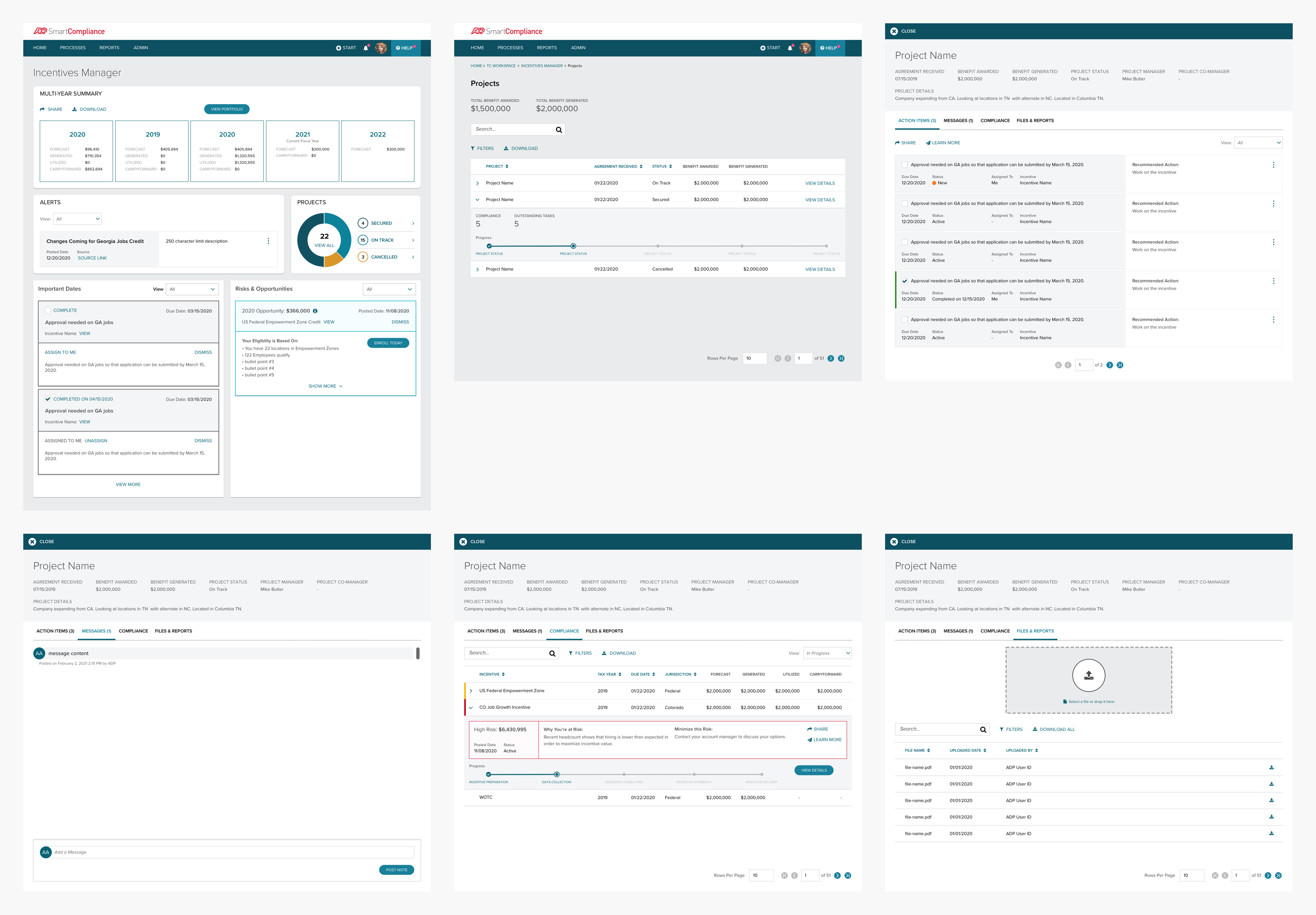
Eventual replacement of the current tax credits workspace. The dashboard page will be a client’s entry point to their incentives portfolio by providing a visualization of year-to-date portfolio values with the potential to show a breakdown of these values by tax year. This page will also inform clients about potential risks and opportunities within their portfolio.  

Portfolio page

Displays all incentives of a client’s portfolio and allows them to drill down into each incentive’s YTD values, status, potential risk/opportunity, and progress. Incentives will be grouped by Above Line or Below Line.

Above Line: incentives that generates revenue (a check) from the government (federal or state)   
Below Line: incentives that are claimed in a tax form as a reduction against liability
Incentive Status Slider

Provides more insight on each progress step for an incentive and allows clients to communicate with their ADP associate through the Notes feature.

MVP Wireframes
- MVP Wireframes -
UX Research - Wireframes

Before moving onto mockups, I collaborated with one of our UX researchers to organize usability sessions with a couple of our clients to do some validation on my wireframes. This included creating a moderator guide, reaching out to ADP associates for their client lists, scheduling clients, and moderating the sessions. Each testing session was 60 minutes and consisted of one-on-one interviews followed by a usability test using an Invision prototype.

The primary objectives of the research were:
  • Confirm that we are surfacing the correct data to all users (i.e practitioners and directors in tax and human resources) and discover what additional data may be necessary
  • Validate the language we are using to label the different sections of the workspace
  • Confirm that the visual language is intuitive and easy to navigate for all users

A challenge we encountered was the primary user group the wireframes were designed for, tax directors & administrators participating in ADP’s business incentives program, were very difficult to recruit. Therefore, we had to recruit from a secondary user group identified: mostly HR practitioners with experience in SCP and ADP’s WOTC program.

Summary of findings:
  • The path through the space, from the highest level down to the most granular, was intuitive for all users; they all moved without hesitation through the pages
  • Most users noted that the UI was "clean" and provided enough information without being "cluttered"
  • All participants, regardless of job level or focus (tax vs. HR), reported that the information provided in this workspace would be helpful in their daily work; although HR professionals focused almost exclusively on the WOTC information provided
  • The biggest opportunities uncovered were the need to reevaluate some of the labeling and data shown on the Portfolio Page
Mockups

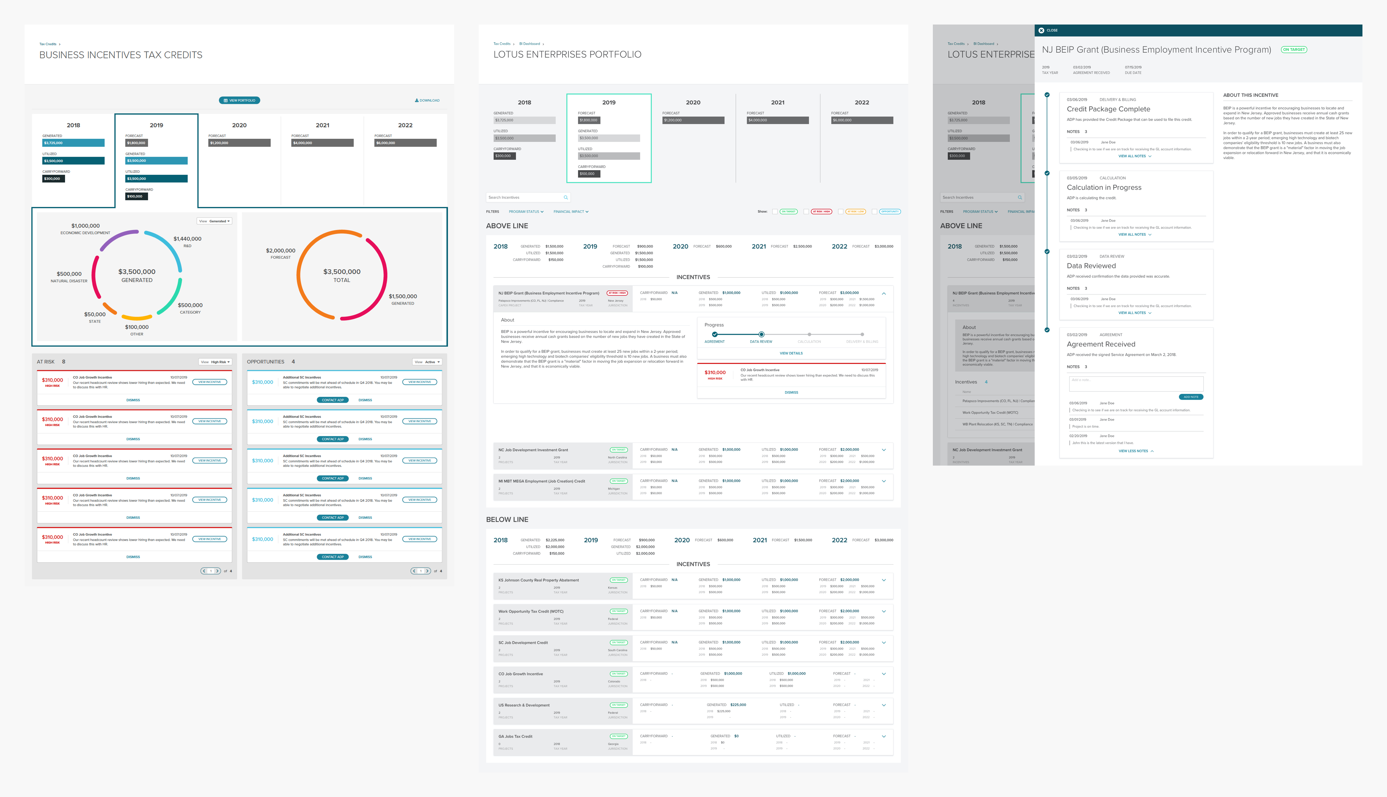
Utilizing the findings from our first round of usability sessions, I began working on the MVP mockups. The following screens were finalized after multiple design reviews with the SME and PO.

MVP Mockups
- MVP Mockups -
Notable changes:
  • Removal of breakdowns for each tax year due to lack of requirements
  • Removal of “Above Line” and “Below Line” groupings on the Portfolio page. Upon further discussions with the SME, we determined that the tax credits database does not group by these categories and there are no plans to implement this categorization in the near future. Instead, incentives will be grouped by child company if applicable
  • During a design review I had with my UX team members, we discussed the purpose of the Incentive Details slider and how its functionality was very similar to an existing page template within SCP. Also, an additional requirement was uncovered that incentives are split into two categories and required updates to the slider that made it less viable. To keep in line with SCP design library and fulfill the newly discovered requirements, I updated the slider’s design to utilize the page template
UX Research - MVP

We were able to do another round of usability sessions after the MVP went live. A challenge we had in the last round was recruiting the primary user group, however after clients and associates had a chance to use Incentives Manager within SCP, we were able to schedule sessions with clients in the primary user group.

The primary objectives of the research were the same as the first round of usability sessions:
  • Confirm that we are surfacing the correct data to all users (i.e practitioners and directors in tax and human resources) and discover what additional data may be necessary
  • Validate the language we are using to label the different sections of the workspace
  • Confirm that the visual language is intuitive and easy to navigate for all users
Summary of findings:
  • Most users wanted to see a to-do list of tasks they could work on for their incentives
  • Some users felt the data shown was too generic and wanted to see a detailed breakdown of each value presented
  • Most users wanted more information about their risks and opportunities. They felt that the information currently shown did not give them the confidence to make any decisions and it was unclear as to what steps they could take to mitigate risks/pursue opportunities
  • Due to a shift in security protocol at ADP, clients were no longer allowed to send nor receive documents from their ADP associates via email. As a workaround, clients were asked to keep all communication and file management within the Incentives Details page. However, most clients found the Notes feature too cumbersome to use when talking to their ADP associate
  • All users mentioned taking a screenshot of the multi-year summary on the Dashboard page to present to their leadership and liked having the visual to add to their presentations

- Post-MVP Work -

It was interesting to see the polarity between the responses of the first and second rounds of usability sessions. I met with the SME and PO to review our roadmap and discuss what changes needed to be made to accommodate the feedback we had received. Upon further discussion, I learned that the MVP was created based on the SME’s knowledge of a certain group of clients which only made up 2% of Incentives Manager's client base. The participants we interviewed in the usability sessions were not a part of that 2%.

We agreed that before we could proceed with further updates to Incentives Manager, we needed to identify what user groups are using the product and what their top tasks are.

Table of Incentives Manager user segments
- Table of Incentives Manager user segments -

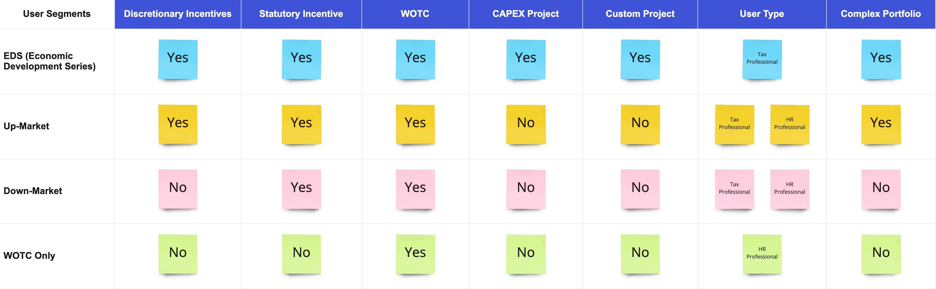
Within these four segments, Down-Market and WOTC clients make up the majority of Incentives Manager users and all usability session participants belonged in those two segments. The SME stated that the MVP requirements we agreed upon were centered around EDS clients that have different data requirements for their incentives portfolio. Therefore, it made sense that the clients we interviewed did not feel the MVP experience was showing what they needed.

In addition to the four user segments, we separated our clients into two categories:

Low Volume

clients with less than 10 incentives; can be any combination of the above segments

high Volume

clients with more than 10 incentives; can be any combination of the above segments

These categories will help us determine what content to surface within Incentives Manager and how the UI will change based on the amount of incentives data shown. We already have a good idea of the top tasks for Down-Market and WOTC clients from our usability sessions, so I focused on brainstorming the top tasks for Up-Market and EDS clients with the SME and PO.

After these discovery sessions, we updated our roadmap to include the following:
  • Add a to-do list (action items) into Incentives Manager
  • Update opportunities to provide more information on next steps and eligibility. This will drive enrollment in business incentives and move more low volume clients into the high volume category
  • Focus on displaying relevant content in Incentives Manager based on user segment and top tasks, rather than a “one size fits all” approach. The amount of information needed to be added to the current experience made the MVP UI no longer viable
Action Items & Opportunities

Gathering requirements for a redesign of Incentives Manager would take some time, so I began working on two updates that the PO and I felt were easy wins: adding Action Items & updating Opportunities. We had enough data from the ERP database to work off of and we already knew from our usability sessions that Down-Market and WOTC clients wanted these features.

Action Items & Opportunities
- Action Items & Opportunities -

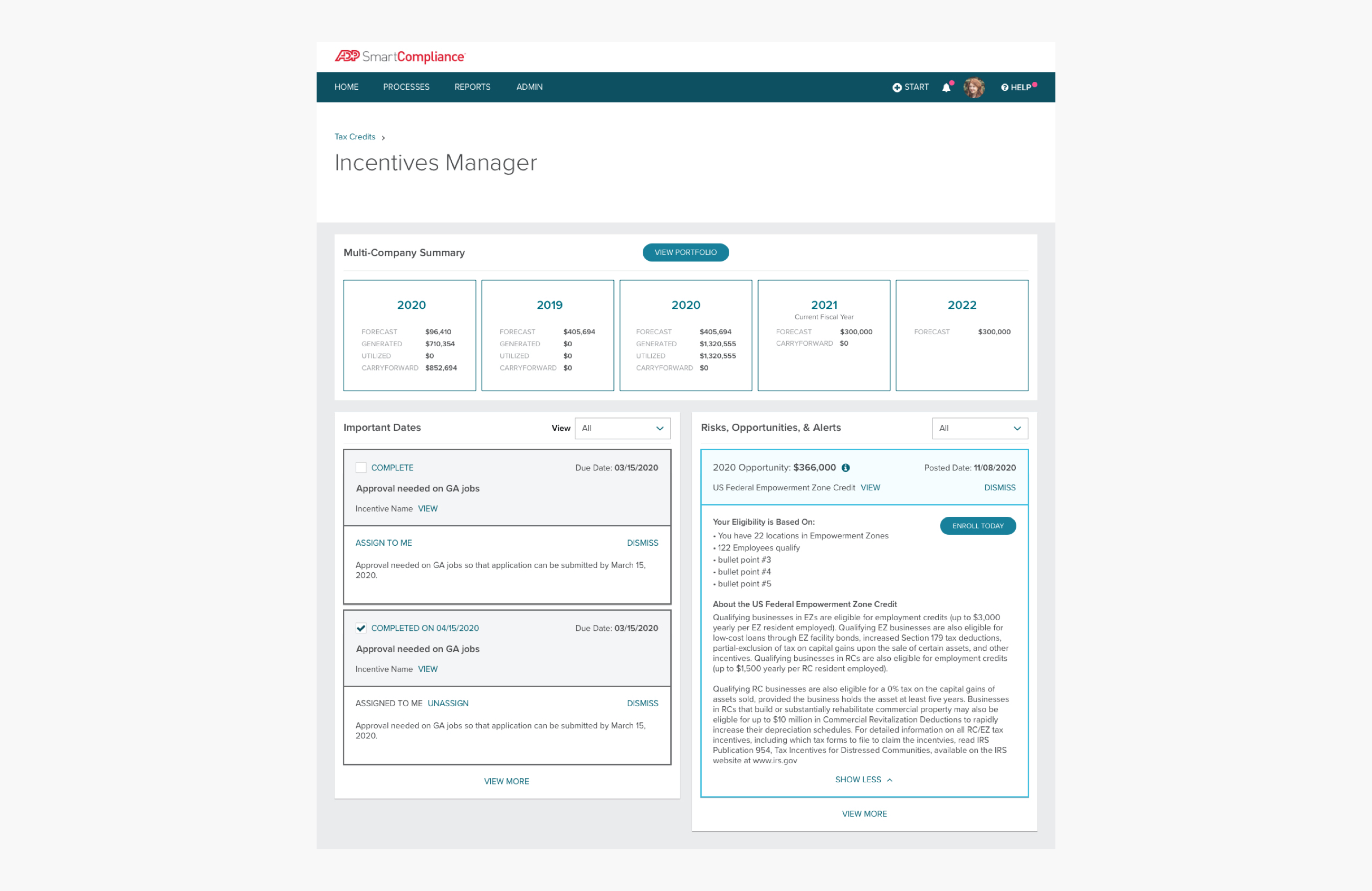
Action Items are essentially to-do items for a client's incentives grouped under a section called Important Dates. Opportunities were updated to provide information, such as eligibility information, that would help decision makers decide which opportunities to pursue. I also worked with the PO to design an email digest that would be sent out to clients alerting them of new opportunities.

UX Research - WOTC Only Clients

In order to validate the recent updates made to opportunities, the PO and I decided to run a couple of usability sessions with WOTC Only clients. This user segment was recently given access to Incentives Manager and belonged to a different business segment of tax credits. Therefore, these clients would provide great insight on what opportunity information would drive them towards enrolling in business incentives. Also, one of our long-term goals is to replace the current workspace with Incentives Manager, so we needed to understand what data WOTC clients need to complete their daily tasks and the frequency in which they access this information within SCP.

The primary objectives of the research were:
  • Understand the current workflows of the WOTC Only user segment so that we know what WOTC-specific data needs to be surfaced in Incentives Manager
  • Confirm that we are showing relevant information within opportunities that resonate with decision makers and discover what additional data may be necessary
  • Validate the language we are using for CTAs within the opportunity tile
Summary of findings:
  • Gained insight on the current workflows of WOTC clients. Previously, we did not have any visibility regarding their processes. This allows us to determine what data needs to be migrated to Incentives Manager before we can retire the current tax credits workspace
  • All users did not feel comfortable clicking on “Enroll Now” as they were not decision makers. They were also hesitant to click on “Dismiss” because they did not know if they could undo the action
  • Because most participants were not a decision maker, they wanted to be able to share opportunity information with their leadership within the tile
  • Most users liked receiving an email notification for new opportunities. They liked that ADP was handling all the research for them; all they have to do is send the information over to their decision makers
Example of a user flow created for a usability session participant
- Example of a user flow created for a usability session participant -

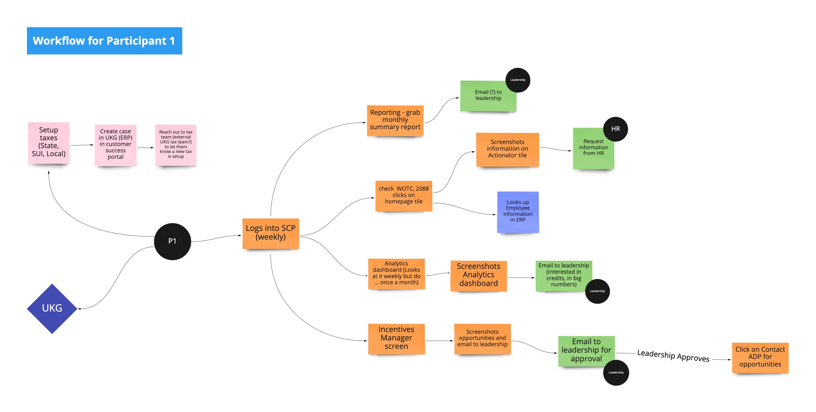
During this round of usability testing, I introduced a new activity for mapping out a participant's current process within Miro, an online collaborative whiteboarding platform. Team members assisting with note taking during a usability session would use Miro to map out a client's user flow on the fly. We would then use these user flows to aid in discussions during our debriefs where we affinity map our notes and determine what areas we still need clarity on.

Consolidated Dashboard for Low Volume Clients

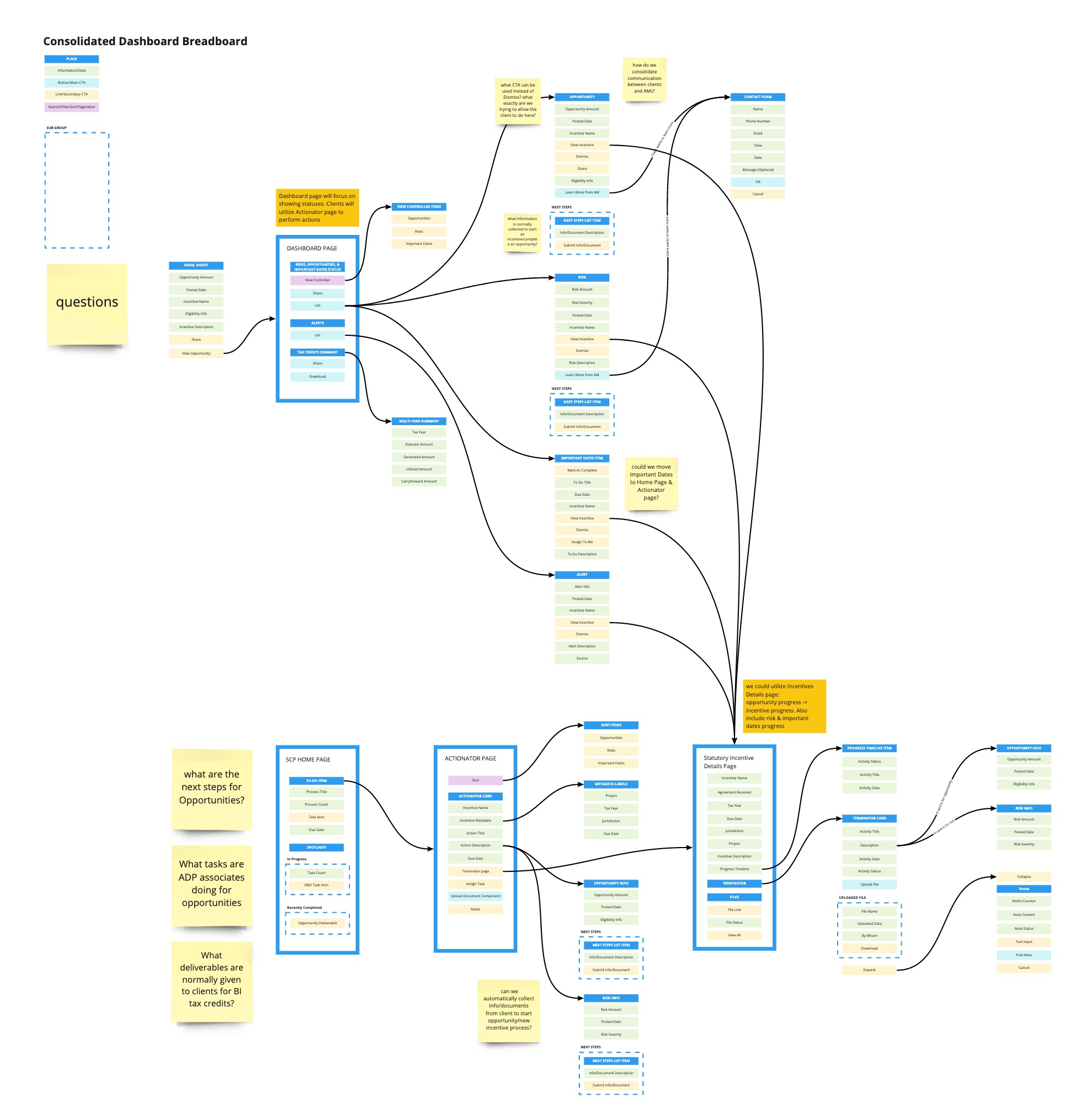
The next step for Incentives Manager is to update the product so that relevant data is displayed based on user segment and top tasks. The PO and I decided to focus on creating a specific dashboard view for low volume clients mainly because we had the most data on this specific category and it is easier for us to validate designs with these clients. While finalizing requirements, I introduced a new activity called breadboarding into my UX process. The user flows I had been creating before did not allow me to gain a deep understanding of how components within the product connect with each other. I also wanted to break a habit the SME and PO have where they would create their own wireframes and present them as final requirements. I noticed that during our meetings we would mainly focus on how the product would look rather than how the product would work. Breadboarding allowed us to see the top-down plan for the entire product while we are figuring out what’s going in it.

Breadboard for Consolidated Dashboard
- Breadboard for Consolidated Dashboard -
Goals for the Consolidated Dashboard:
  • Create an experience specific for low volume clients. Based on the feedback we gathered so far, this category of clients mainly focuses on completing tasks that allow them to obtain the maximum tax credit amount from their incentives
  • Reduce the amount of navigation needed to view a client’s incentives portfolio since they have a small amount of incentives
Sample of A/B test responses
- Sample of A/B test responses -

While working on the consolidated dashboard, I wanted to validate a couple of explorations I have been working on. Unfortunately, we were unable to schedule any clients for usability sessions due to tax season. I met with our UX researcher to brainstorm what alternative UX research methods we could use to obtain feedback and decided to create an A/B test within Pendo, our product analytics software. By placing the A/B test within a Pendo guide, we were able to choose where the guide showed up within Incentives Manager as well as what user segment would be able to view the guide. Using this method, we were able to obtain a good amount of responses that helped determine which exploration our low volume clients resonated with the most.

Consolidated Dashboard mockup
- Consolidated Dashboard mockup -

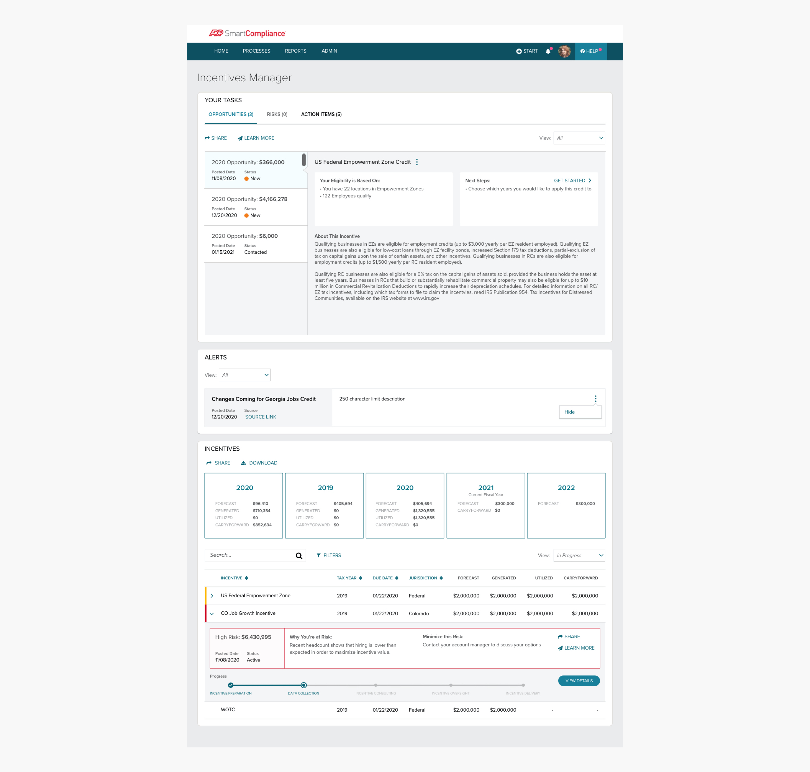
The original design for Risks and Opportunities no longer worked as we discovered through our usability sessions that clients wanted to see more information such as what steps they could take to minimize a risk/pursue an opportunity. They also prioritized tasks they could work on that would maximize the tax credit amount received from their incentives.

Notable changes:
  • Opportunities and risks are types of tasks, so I grouped them with Action Items and placed the section above the fold
  • Incentive data was condensed down into a data grid and placed on the dashboard page, allowing clients to view their incentives portfolio without having to navigate to the Portfolio Page
  • Combining the multi-year summary with the incentives data grid made sense since the data grid is essentially a breakdown of the multi-year summary values
  • I spoke to the development team about prioritizing the Download feature for multi-year summary, since a lot of clients are screenshotting the summary to show to their leadership. I had originally included the feature within the MVP mockups, but the development team did not have enough bandwidth at that time to work on it. We agreed that the feature would be made available for multi-year summary first and may include the incentives data grid in the future depending on user feedback
Projects Feature for EDS Clients

After I handed off the consolidated dashboard assets to the development team, I met with the SME and PO to begin discussions on a specific feature for our EDS clients called Projects. These clients make up 2% of Incentives Manager’s user base, however they manage a huge amount of incentives and are a top priority for business and sales.

EDS clients maintain an additional type of incentive called discretionary incentive within their portfolio. These incentives are typically grouped into projects that are managed by an ADP associate and negotiated with federal or state governments to outline the project's purpose and what commitments the company needs to fulfill in order to generate credit. Each project will be different based on what’s been negotiated. Because these aren’t necessarily standard incentives, the roll up of tax credits for a project is called a Benefit. Whether the client does all the necessary things to generate the total awarded or not is dependent on the incentive agreements.

Project example:
A client has a project called Green Jobs. All of the incentives negotiated for the project are related to things the company promises to do to help the environment while in the process of hiring individuals.
Discretionary Incentive: Discretionary tax incentives are awarded on a case-by-case basis to entice particularly desirable employers to relocate or expand in the area. Discretionary incentives are secured through a process that begins with an application outlining the project, including job creation, capital investment, and additional relevant information about the company. The incentives are generally negotiated prior to the proposed relocation or expansion and usually require pre-certification that the company will fulfill its commitments. The process concludes with an incentives agreement.
Breadboard for Projects
- Breadboard for Projects -
Goals for Projects feature:
  • Allow EDS clients to be able to manage their projects within Incentives Manager
  • Determine what existing project data can be imported from Dynamics and if any new data fields need to be created
  • Ensure clients have an easy communication tool with their ADP associate
  • Provide a detailed view of a project's action items, files, and list of all secured incentives
Projects mockups
- Mockups for Projects feature -
Notable changes:
Dashboard page

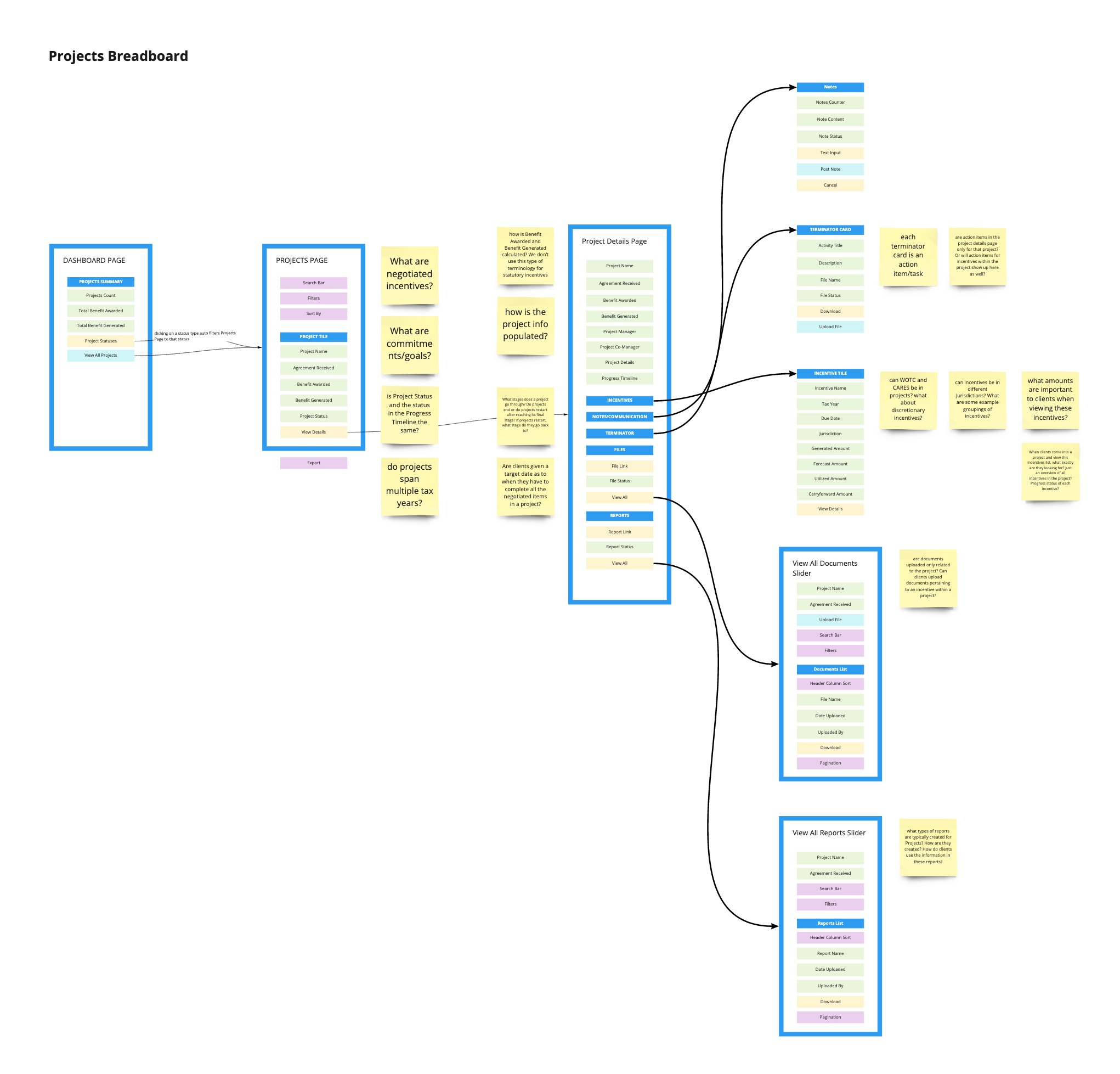
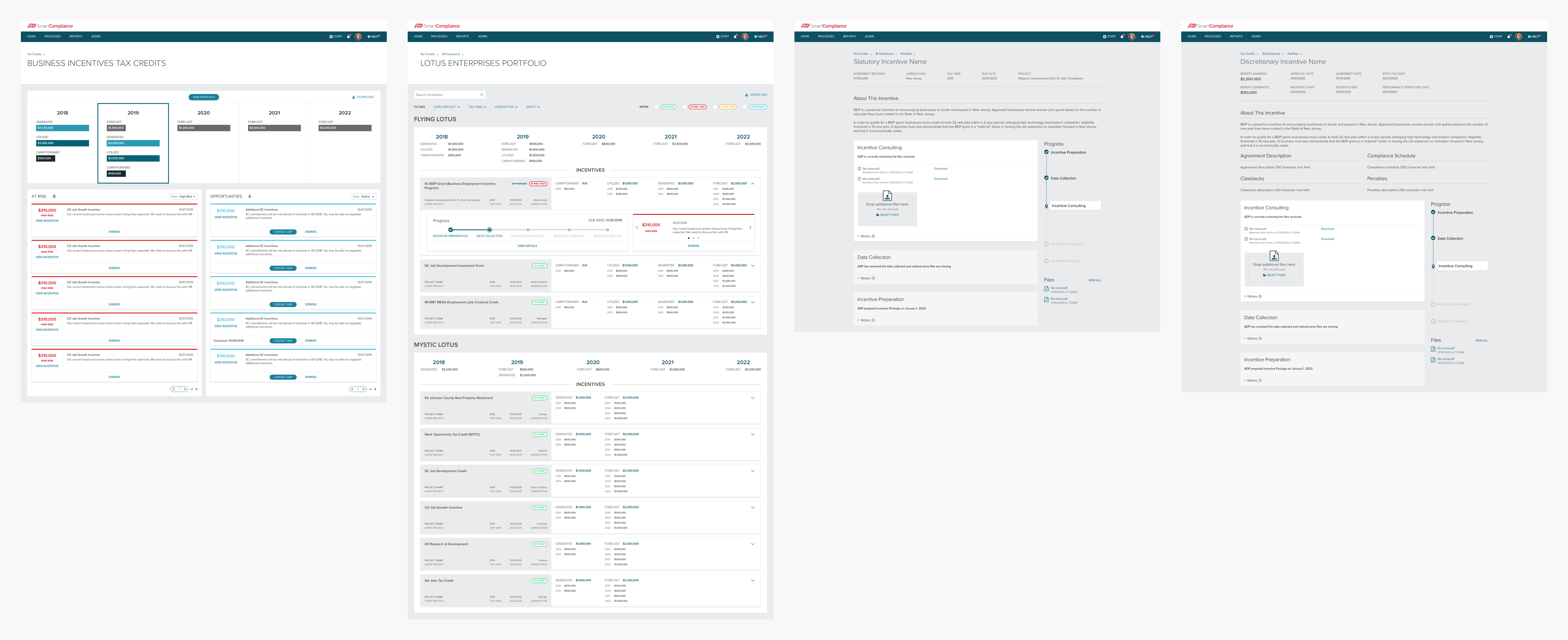
Created a Projects tile that shows project count and project status. Also included a couple of updates from the Consolidated Dashboard.

Projects page

Utilizing a new page template from the SCP design library, the Projects page provides an overview of a client's projects. Each project row shows a project's status, YTD values, and progress. Clients can also view more information about a project via the project details slider.

Project Details Slider

Provides a singular area where a client can view detailed information and work on tasks assigned to the project. Includes a new communications component that will eventually replace Notes within Incentives Manager. Client can also drill down into each secured incentive's YTD values, status, potential risk/opportunity, and progress.

Unfortunately, requirements were not finalized for Projects until two weeks prior to the development team’s scheduled sprint for this feature. I was able to breadboard the requirements, create the mockups, and obtain some internal feedback from the SME before handing off the assets to the development team. I still plan to validate these designs with EDS clients and am currently working with our UX researcher to schedule usability sessions.